Grocery Go Go
An App that enhances your grocery shopping experience.
UX & UI Design
January 2025
Summary:
I created a dedicated mobile app called Grocery Go Go. It’s an app that assists with in-person grocery shopping, with special emphasis on users with food allergies and limited free time. I empathized, defined user needs, ideated solutions, created prototypes, and tested my designs. The result is an intuitive, incredibly useful app that is beneficial for all grocery shoppers.
Timeline:
January, 2025
Role:
Lead UX/UI Designer
Skills:
UX Research
Wireframing
Lo- and Hi-Fi Prototyping
Design Systems
Tools:
Figma

Design Challenge:
Design an app for a local grocery store that helps shoppers locate products as they shop in person.
My goal:
Help people with food allergies, preferences, diets, and limited time efficiently locate groceries.
My Role
Lead UX Designer
I lead, managed, researched, and designed this entire project. With the help of usability study participants, I created a useful app for grocery shoppers everywhere.
Responsibilities
User Research: storyboards, user personas, journeys and flows. I completed a competitor audit and two usability studies.
I also created wireframes, mockups, and lo- and hi-fi prototypes.
Grocery Go
Grocery Go
Design Solution:
Meet Grocery Go Go, an app that locates and leads you to each item on your grocery list!
UX Research
Storyboards
Pain Points
Personas
User Journeys
Competitor Audit
Storyboards

Close-Up

Big Picture
Pain Points
Support
Can’t locate a specific item due to high quantity of inventory or shelf height
Product
People with food allergies have to search each item individually to see which products they can eat
Process
When inventory is moved, shoppers still want to find their go-tos quickly
Financial
Want to easily compare product prices or only shop for items within their budget
Personas

Naomi

Martin
User Journeys

Naomi

Martin
Competitor Audit
I completed a competitor audit on 2 direct and 1 indirect competitors: Hungryroot, Whole Foods, and eMeals.
Goal
Compare the grocery shopping assistance and allergy-friendly product navigation of each competitor's app or website.
Discoveries
I made notes on each competitor in 4 categories: first impressions, interaction, visual design, and content. I found that the best-performing competitors had above average features, navigation, flow, brand identity, and tone. They establish and maintain customer rapport.
Paper Wireframes
I created five drafts of wireframes for the app, including “must-haves.” I iterated on different ideas for navigation with user ease as my main priority.


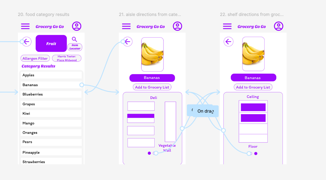
Digital Wireframes


Usability Study Findings
Usability Study 1
Lo-Fi Prototype
5 participants, (3 females and 2 males), ages 25-57.
Insights:
The word “preferences” needs to be specified - clarify between preferences on Home Screen and in the dietary restrictions section
There should be clarity on what a Preference List is - it functions as a Grocery List
It would be beneficial to add a Back button from the Account Profile to the Home Screen

Style Guide

IA
Hi-Fi Prototype
Key user journeys:


Participant D
“Overall, amazing! I love!”
Participant B
“The navigation feels extremely intuitive.”
Usability Study Findings
Usability Study 2
Hi-Fi Prototype
5 participants (2 females and 3 males), ages 25-57.
Insights:
Users are energized and excited by the visual design, images, and icons.
Users are pleased with the most refined version of the app and excited to incorporate it into their grocery shopping experience.
Users wanted to explore the app beyond the prompts.
Accessibility Considerations
Color Scheme
When selecting the color scheme, I made sure to choose colors with a high contrast. The shade of purple I chose pairs nicely with the shades of white and gray. It also easily stands out, highlighting important information to users.
Gestures
I included multiple gesture options to improve accessibility. The incorporation of both swipe and tap gestures extends usability to those with limited or divergent movement abilities.
Images
The inclusion of product images assists those with and without ADHD. The images draw in user attention to the most important part of the page, immediately signaling that they are in the right place.
What I Learned
The Need
This project has shown me that there is a real need for this app. My usability study participants helped me see the importance and usefulness of this app, as well as areas of improvement.
UX Design
I learned so much throughout this project, including the importance of feedback and flexibility. I learned how gratifying it is to design an app in its entirety, and I’m very thankful for this opportunity to explore different components of UX Design.
Next Steps:
1. Share Designs
Share designs, mockups, and relevant project details with the engineering team.
2. Updates
Make design updates as needed.
