Grocery Go Go:
Responsive Website and Web App
UX & UI Design
February 2025
Summary:
During my UX Design certification, I created a responsive website and mobile web app based on the dedicated mobile app I designed call Grocery Go Go. I created intricate web applications for multiple screen sizes, ensuring correspondence and coherence across all platforms. I researched, designed, and refined each product that assists with in-person grocery shopping, with special emphasis on users with food allergies and limited free time.
Timeline:
February, 2025
Role:
Lead UX/UI Designer
Skills:
Lo-Fi Prototyping
Hi-Fi Prototyping
Mockups
Design Systems
Tools:
Figma

Design Challenge:
Design a responsive website and web app for a local grocery store that helps shoppers locate products as they shop in person.
My goal:
Help people with food allergies, preferences, diets, and limited time efficiently locate groceries.
My Role
Lead UX Designer
I lead, managed, researched, and designed this entire project. Through completing every step of the design process on my own, I created a new world of possibilities for grocery shoppers everywhere.
Responsibilities
I applied the work I completed on my corresponding app, including user personas and research, a competitor audit, and two usability studies.
I also created storyboards, wireframes, mockups, and lo- and hi-fi prototypes.
Grocery Go
Grocery Go

Design Solution:
Meet Grocery Go Go, a product that locates and leads you to each item on your grocery list!

User Research
I kept my app’s user personas in mind while expanding my website’s target users to include people with time to plan and research their groceries in advance. These target users are part of an older demographic, so using the computer could be more familiar to them than a mobile device.
These target users influenced button sizes, the (majority) single column layout, and page focal points.
Wireframes

Paper Wireframes: Desktop

Paper Wireframes: Mobile

Paper Wireframes: Tablet
Digital Wireframes: Desktop
These digital desktop wireframes include a view above and below the fold and crucial user journey screens for checking off items within a grocery list.

Digital Wireframes: All Screens
I created digital wireframes for a desktop, a tablet, and a mobile device utilizing Gestalt Principles such as similarity, proximity, and common region. I also utilized columns and gutter width on Figma to accurately resize the dimensions of assets for each screen size.


Desktop Mockup

Responsive Webb App Mockup
I utilized a navigation bar on the home screen and a hamburger menu on the following pages to save space and give the user room to explore the web app’s functions.

Hi-Fi Prototype

Accessibility Considerations
Initial Focus
Concision was key as I utilized space and color to enhance clarity on user actions and product functions.
Headings
I used bold, large headings for the titles of the pages, sections, and the logo. This enhances and provides a clear understanding of information architecture.
Navigation Bar
With a navigation bar on the desktop and a hamburger menu on the responsive web app, I thoughtfully utilized each screen size and had more room to accentuate the product focal points.
What I Learned
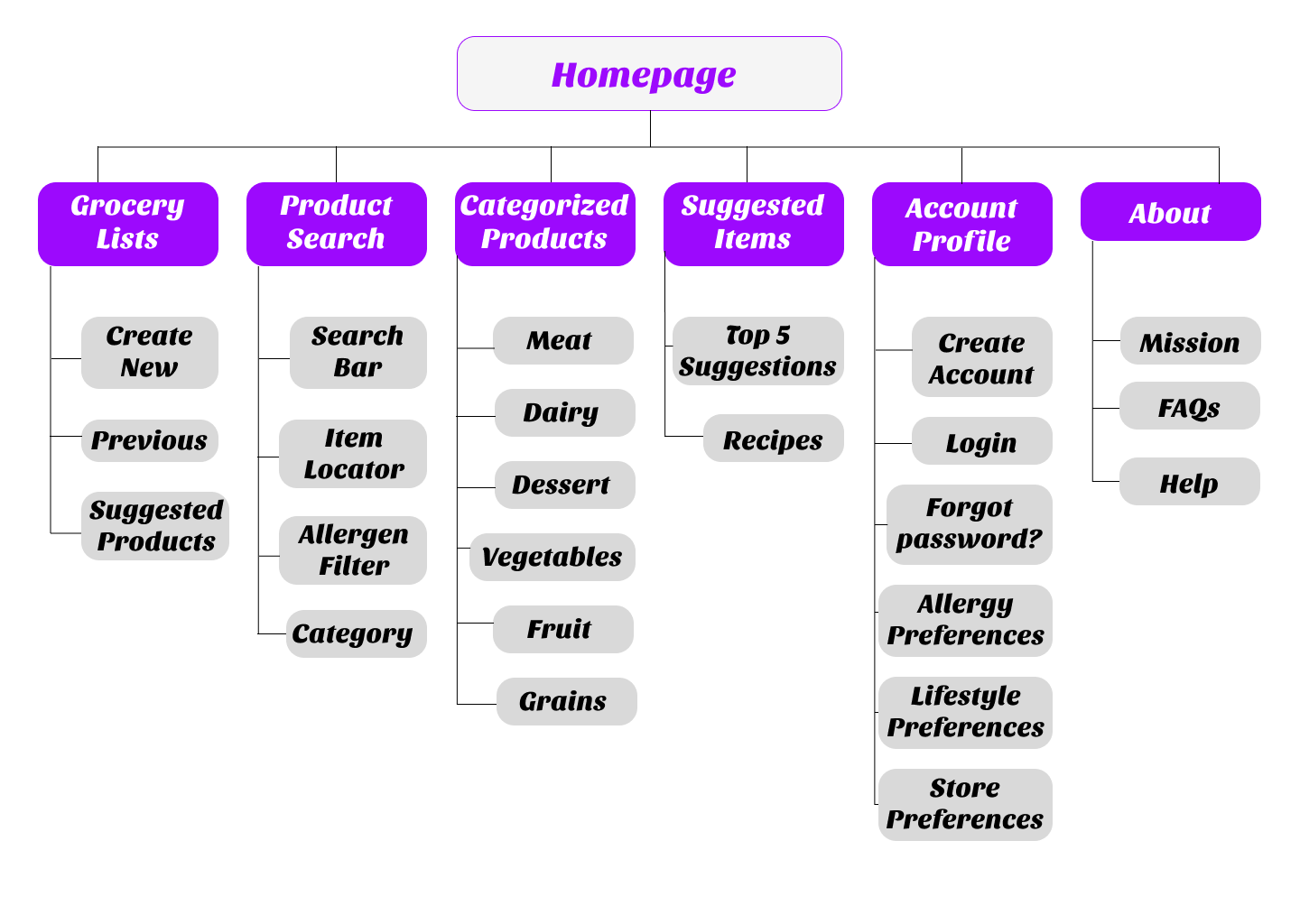
Information Architecture
Planning responsive websites is an important way to enhance the ux and create an intricate product structure based on an understanding of its purpose and organization.
Hierarchical Model
It’s important to organize information by importance so users feel comfortable navigating the product on their own. This will make users want to explore and continue using a product they understand.

Design Systems
Creating a design system saves so much time and creates consistency within the design. I learned lots of Figma shortcuts and incorporated components to increase efficiency.
Next Steps:
1. Usability Study
Conduct a usability study with my hi- prototype, obtaining feedback from at least 5 participants from varyingbackgrounds.
2. Insights
Utilize the usability study feedback to develop insights on areas of improvement. Evaluate the priority of each, thenimplementthemasneededtore nethedesigns.

Responsive Website & Web App
